One of the great joys of designing is finding clever little solutions to problems that seem impossible to solve at first glance. In this case, we just didn’t have the technology to implement search across our property insurance platform. Now, that’s a serious problem because our platform listed hundreds of thousands of properties and files for each client. Ultimately, we did need to implement search, but I came up with some neat stopgap UX in the meantime.
I was a product designer at Archipelago, working within my own pod of one PM and two engineers. So for this project, and all projects, I was the sole designer. I designed not just the platform but also internal tools to support it. As I worked on each project, I was able to carry over solutions to other parts of the platform.
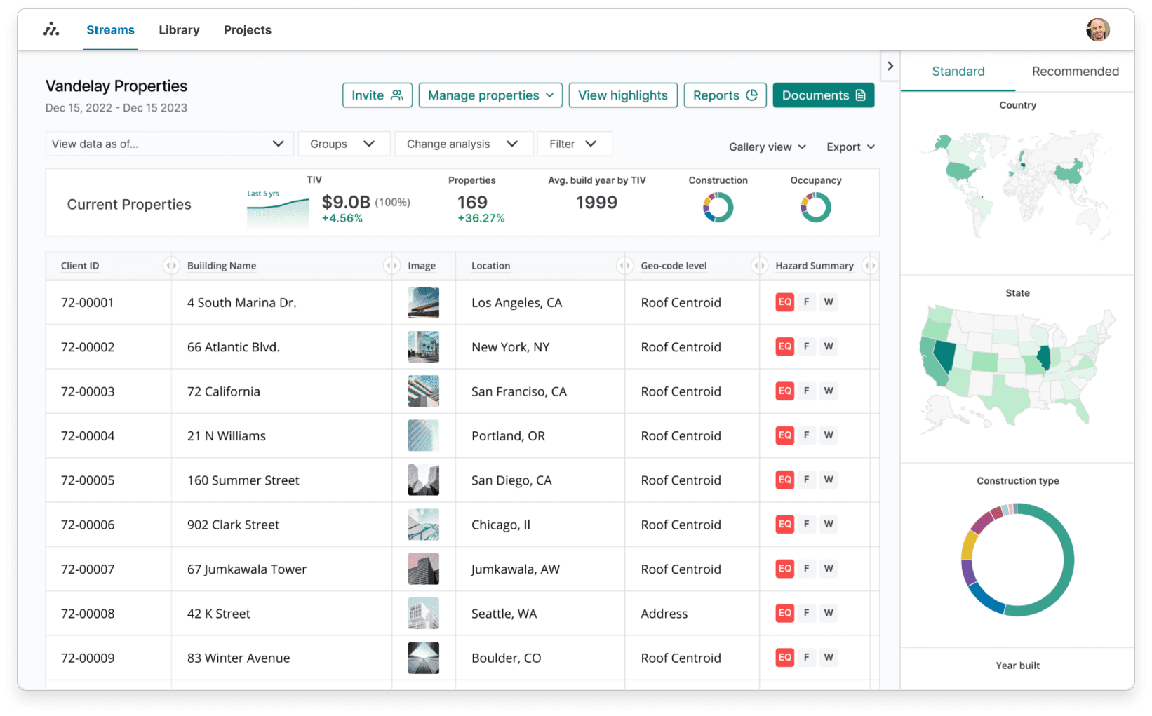
Our platform was built for all parts of insurance and risk assessment professionals. It was also built for the account managers and engineers who supported them. In this unique case, there wasn’t too much of a difference in each user group’s needs.
I started by designing and launching a file management MVP (like Google Drive) for the platform that could:
Organize hundreds of thousands of documents across multiple client accounts
Surface relevant files quickly
Increase platform value by replacing the need for third-party storage tools
However, search functionality was unavailable due to backend limitations. File names were often inconsistent or unclear, which ruled out basic string-matching or naming-based filters. The design needed to compensate for all of this and still deliver a fast, usable experience.
I began by partnering with account managers to understand how they located and shared documents. Through interviews, live working sessions, and recorded calls with clients, I uncovered their organizing strategies, naming workarounds, and the mental shortcuts they used to retrieve specific file types.
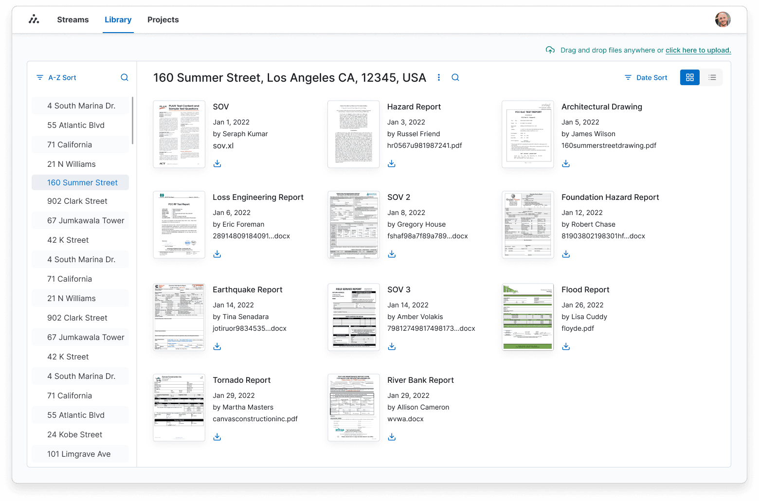
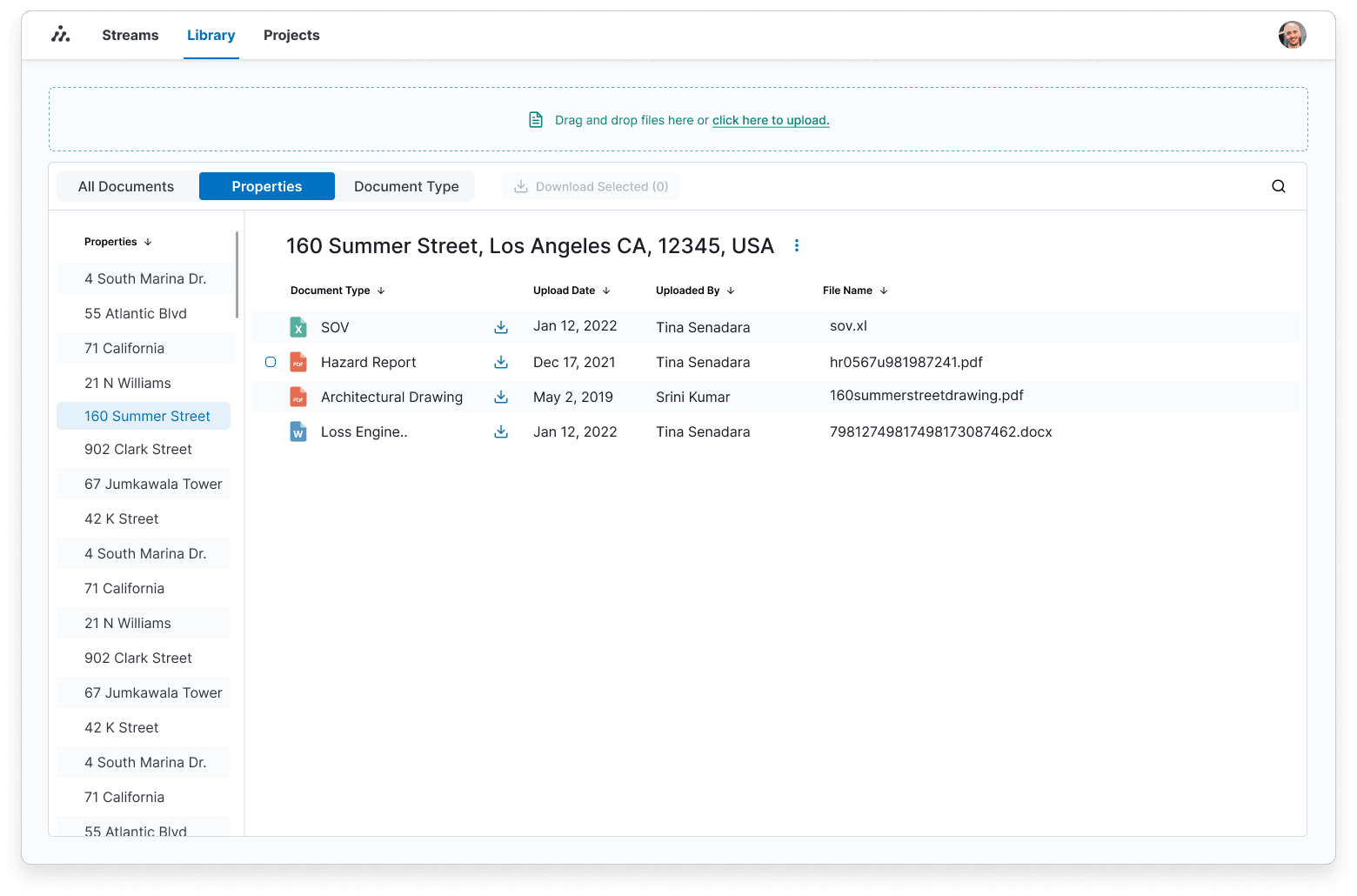
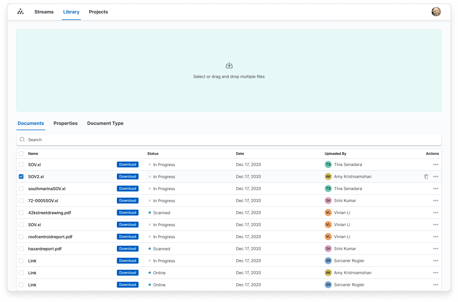
Based on these insights, I designed a feature that would automatically tag and sort files. Our engineers used machine learning to identify the file type (e.g., fire hazard report, SOV) and the locations the files were related to. The file browser’s UI emphasized these and other identifying factors so users could find the files faster. Utilizing simple metadata like date and author made a huge impact in helping users navigate large folders.
We launched the MVP internally with account managers, who frequently needed to retrieve documents like SOVs under time-sensitive conditions. Prior to the redesign, finding a single file could take anywhere from 1 to 12 minutes. After the launch, the average retrieval time dropped to 30 seconds, with a maximum of 2 minutes.
This shift significantly improved daily workflows and validated that UX—even without a search engine—can drive both speed and perceived product quality. I carried these solutions forward and built on them in other parts of the platform, including the home page/dashboard, as seen above.